Modern Bento Grid Layout Product Display Design
Modern Bento Grid Layout Product Display Design, utilizing frosted acrylic transparent glass material. Suitable for any product type (food / medicine / tech products / elements, etc.). 【Layout Struct
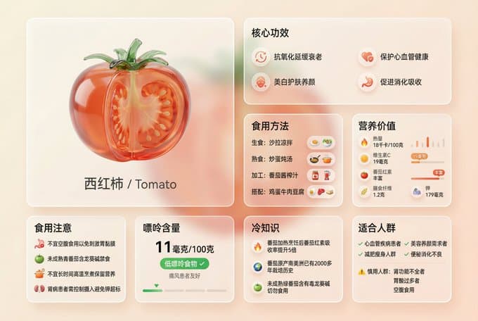
Modern Bento Grid Layout Product Display Design, utilizing frosted acrylic transparent glass material. Suitable for any product type (food / medicine / tech products / elements, etc.). 【Layout Structure】8 modules, asymmetrical Bento grid arrangement, landscape format: Module 1: 【3D Glass Product Main Display】(Medium size 1x1, occupies 20-25% space) - 3D transparent glass / acrylic sculpture of [Product Name] - [Product Features]: * Food → Display cross-section / internal structure (e.g., tomato seed chambers, carrot cross-section) * Medicine → Transparent glass form of tablets / capsules * Tech products → Artistic glass rendition of product appearance - Material effect: Transparent red-orange / blue / green, etc. [Product Main Color] glass, glossy surface, light refraction, realistic reflection - Text label directly below: "[Chinese Product Name] / [English Name]" - Does not take up too much space, leaving ample display area for information modules Module 2: 【Core Efficacy / Features】(Standard card 1x1) Title: "Core Efficacy" or "Core Features" or "Main Functions" Content: 4 core selling points, separated by "/" - Food → "Antioxidant and anti-aging / Protect cardiovascular health / Whiten skin and nourish complexion / Promote digestion and absorption" - Medicine → "Antipyretic and analgesic / Anti-inflammatory and detumescent / Antiplatelet aggregation / Prevent cardiovascular diseases" - Tech → "Active noise cancellation / Spatial audio / Adaptive EQ / 20 hours battery life" Accompanied by simple icons Module 3: 【Usage Methods / Application Scenarios】(Standard card 1x1) Title: "Eating Method" or "Usage Method" or "Application Scenarios" Content: 4 usage methods / scenarios - Food → "Raw: Salad / Cooked: Scrambled eggs and stew / Processed: Sauce and juice / Pairing: Eggs and beef" - Medicine → "Oral: Take with warm water after meals / Dosage: Adult 100mg / Frequency: 1-2 times daily / Course: As directed by doctor" - Tech → "Music appreciation / Commute noise cancellation / Home office / Movie entertainment" Accompanied by scenario icons Module 4: 【Key Data / Parameters】(Standard card 1x1) Title: "Nutritional Value" or "Technical Parameters" or "Product Specifications" Content: 5 key data points - Food → "Calories [X] kcal/100g / Vitamin C [X] mg / Rich in [Special Ingredient] / Dietary fiber [X] g / Potassium [X] mg" - Medicine → "Composition: [Chemical Formula] / Specification: [X] mg / Onset time: [X] minutes / Half-life: [X] hours / Metabolism pathway: [Pathway]" - Tech → "Chip: [Model] / Battery life: [X] hours / Weight: [X] g / Driver unit: [Specification] / Charging: [X] hours" Accompanied by simple data visualization charts Module 5: 【Target Audience / Users】(Standard card 1x1) Title: "Suitable for" or "Target Users" or "Applicable Scenarios" Content: Divided into recommended (✓) and cautionary (⚠️) parts - Food → "✓ Cardiovascular disease patients / ✓ Those seeking beauty and skin care / ✓ Weight loss groups / ✓ Constipation and indigestion / ⚠️ Caution: Renal insufficiency / Excessive stomach acid / Eating on an empty stomach" - Medicine → "✓ Fever patients / ✓ Mild to moderate pain / ✓ Inflammatory diseases / ⚠️ Contraindications: Pregnant women / Asthma patients / Gastric ulcer" - Tech → "✓ Music enthusiasts / ✓ Business professionals / ✓ Commuters / ✓ Content creators" Distinguished by green ✓ and amber ⚠️ Module 6: 【Precautions / Usage Guidelines】(Standard card 1x1) Title: "Eating Precautions" or "Usage Precautions" or "Important Notice" Content: 4 important reminders - Food → "Not suitable for consumption on an empty stomach to avoid gastric mucosa irritation / Immature [Product] containing [Toxic Substance] is forbidden / Avoid prolonged high-temperature cooking to retain nutrients / [Special Population] needs to control intake" - Medicine → "Should be taken after meals to avoid stomach discomfort / Cannot be taken with [Contraindicated Drugs] / Avoid alcohol during medication / Discontinue medication and seek medical attention immediately if allergic reactions occur" - Tech → "First use requires device pairing / Avoid extreme temperature environments / Regular cleaning and maintenance / Charge for storage if not used for a long time" Accompanied by warning icons Module 7: 【Special Indicators】(Standard card 1x1) Title: Adjust according to product type - Food → "Purine Content" displays "[X] mg/100g" + "Low purine food ✓" + "Gout friendly" - Medicine → "Adverse Reactions" lists common side effects - Tech → "Compatibility" displays supported systems/devices Accompanied by indicators or icons Module 8: 【Fun Facts / Product Insights】(Standard card 1x1) Title: "Fun Fact" or "Product Story" or "Interesting Facts" Content: 2-3 interesting facts - Food → "Absorption rate of [Ingredient] in [Product] increases X times after heating / [Product] originated in [Region] X years ago / Immature [Product] contains [Harmful Substance]" - Medicine → "[Product] is one of the most widely used [Category] in the world / Over [X] tons are produced globally every year / Invented in [Year] by [Person's Name]" - Tech → "[Product] adopts [Technology] patented technology / [Brand] first applied [Feature] to consumer products / Global sales exceeded [X] million units" 【Frosted Acrylic Material Specifications】(CRITICAL Core Essence): Card material effect: - Transparency: 80-85% TRANSLUCENT, able to see through the card to the background - Frosted effect: Soft frosted glass blur, backdrop-filter style - Base tone: Slight white / creamy white frosting effect (15-20% opacity), improves readability but maintains transparency - Border: Fine glowing border, captures light reflections - Shadow: Soft layered shadow, creating a floating depth perception - Glass physics: Realistic glass edge highlights, light refraction, surface reflection effects - Visual characteristics: Background gradient is clearly visible through the card, like a real frosted acrylic sheet IMPORTANT: Cards must maintain a TRANSLUCENT transparent texture, not turn into opaque white cards! 【Color Scheme】: Basic color ratio: 90% neutral colors + 10% product theme color accents - Base layer: Transparent glass, light gray, off-white - Text color: Medium dark gray #3A3A3A (soft yet clear, suitable for transparent backgrounds) - Theme color accents (10% usage): * Food → Product natural color (tomato red-orange, carrot orange, spinach green, etc.) * Medicine → Medical blue, medicine white, Red Cross logo colors * Tech → Brand main color (Apple silver-gray-blue, Xiaomi orange, Huawei red, etc.) - Accent positions: Only for key icons, important numbers, warning symbols, 3D main subject - Warning color: Amber orange #FF9800 for ⚠️ warning content - Affirmative color: Green #4CAF50 for ✓ recommended content 【Background Settings】: - Type: Soft gradient, 2-3 similar color transitions - Product color adaptation: * Food → Creamy white - pale peach - light orange (warm tones) * Medicine → Light gray-white - pale blue - medical white (clean and professional) * Tech → Space gray - silver-white - pale blue (tech-inspired) - Decorative elements: Extremely soft abstract shapes, faintly visible through the glass cards - IMPORTANT: Background should be soft and not distracting, visible through transparent cards but not interfering with readability 【Layout and Typography】: - Format: Landscape 16:9 or similar aspect ratio - Grid type: Asymmetrical Bento grid, varying card sizes - Space allocation: * 3D glass subject: 20-25% (medium size, not overly dominant) * Information cards: 75-80% (7 standard cards) - Card spacing: Moderate whitespace, not crowded, good breathing room - Visual hierarchy: Establish information priority through card size, position, and color accents - Reading flow: Starts from the top-left 3D subject, naturally flows to each information card 【Text Specifications】: - Language: All content in Chinese (product names may be bilingual) - Font hierarchy: * Module titles: Bold, large size * Body content: Regular, medium size * Data numbers: Bold, highlighted - Readability: Medium dark gray text is clear and easy to read on frosted glass - Unit norms: * Weight: grams (g), kilograms (kg), milligrams (mg) * Energy: kilocalories (kcal), calories (cal) * Time: minutes (min), hours (h), days (d) * Volume: milliliters (ml), liters (l) 【Icon Style】: - Type: Minimalist line icons - Size: Small and unobtrusive - Color: Light gray lines, key icons accented with theme color - Purpose: Supplementary explanation, enhances visual recognition 【Usage Instructions】: 1. Replace [Product Name] with the actual product 2. Select corresponding content examples based on product type (food / medicine / tech) 3. Fill in specific information for all 8 modules 4. Adjust theme color to the product's representative color 5. Ensure the frosted acrylic translucent texture is maintained 【Quality Standards】: ✓ Correct transparency (80-85%, see-through) ✓ Frosted blur effect is noticeable but not excessive ✓ Background visible through cards ✓ 3D subject occupies appropriate space (20-25%) ✓ Complete information (all 8 module contents are present) ✓ All Chinese display is clear ✓ Color scheme is restrained and elegant (90% neutral + 10% accent) ✓ Layout is comfortable and not crowded ✓ Realistic glass texture (edge highlights, reflections, refractions) 【Typical Application Examples】: Food: 🍅Tomato, 🥕Carrot, 🍎Apple, 🥑Avocado Medicine: 💊Aspirin, Vitamin C, Ibuprofen, Penicillin Tech: 🎧AirPods Max, iPhone, MacBook, Tesla Elements: ⚛️Carbon, Oxygen, Hydrogen, Nitrogen
More from UI Design
View all →
Retro Pixel UI Icons
retexture the image attached in the following json aesthetic style:{"style":"Retro Pixel UI Icons","resolution":"low (32x32 or 48x48)","color_palette":["#F2F2F2","#C0C0C0","#000000","#FFFFFF","#0000FF","#00FF00","#FFFF99","#008080"],"outline":{"enabled":true,"color":"#000000","thickness":"1px"},"shading":{"method":"dithering","colors_used":["base color","highlight","shadow"],"pattern":"checkerboard or diagonal lines"},"lighting":{"type":"flat","source":"top-left","highlight_color":"#FFFFFF","shadow_color":"#808080"},"background":{"color":"#F2F2F2","type":"plain","transparency":false},"object_properties":{"style":"pixel art","perspective":"isometric or front-facing","animation":{"enabled":false,"frame_style":"static pixel art"}}}

Airbnb Style Icons
generate[concept] icon with this json style: { "icon_style": { "perspective": "isometric", "geometry": { "proportions": "1:1 ratio canvas, with objects fitting comfortably within margins", "element_arrangement": "central dominant object, with supporting elements symmetrically or diagonally placed" }, "composition": { "element_count": "2–4 main objects", "spatial_depth": "layered to create sense of dimension and slight elevation", "scale_consistency": "uniform object scale across icon set", "scene_density": "minimal to moderate, maintaining clarity and visual focus" }, "lighting": { "type": "soft ambient light", "light_source": "subtle top-right or front-top direction", "shadow": "gentle drop shadows below and behind objects", "highlighting": "mild edge illumination to define forms" }, "textures": { "material_finish": "semi-matte to satin surfaces", "surface_treatment": "smooth with light tactile variation (e.g., wood grain, soft textures)", "texture_realism": "stylized naturalism without hyper-realistic noise" }, "render_quality": { "resolution": "high-resolution octane 3D rendering", "edge_definition": "crisp, no outlines; separation achieved via lighting and depth", "visual_clarity": "clean, readable shapes with minimal clutter" }, "color_palette": { "tone": "naturalistic with slight saturation boost", "range": "harmonious muted tones with gentle contrast", "usage": "distinct colors per object to improve identification and readability" }, "background": { "color": "#FFFFFF", "style": "pure white, flat", "texture": "none" }, "stylistic_tone": "premium, friendly, clean with lifestyle or service-oriented appeal", "icon_behavior": { "branding_alignment": "neutral enough for broad applications", "scalability": "legible at small and medium sizes", "interchangeability": "part of a cohesive icon system with interchangeable subject matter"} } }

MBTI Personality Type Cards of Famous Opera Scenes
# Task Goal

Minimal Weather Widget
create image with 1:1 ratio surreal minimal aesthetic, airplane window frame on subtle gradient backdrop with same color, through the oval window showing random iconic landmark scenery of [Country Name], an overlay weather ui interface on the center of window, from top to bottom, contain the small weather icon, huge temperatures with elegant light weight font, and small location tag beneath it, the bottom is the country name, generate with extreme weathers, the window will affect by the weather, the color combo of subtle gradient backdrop is resonate with the weather, natural lighting, soft shadows, subtle reflections on glass, great negative space
Hand-Drawn Infographic Card
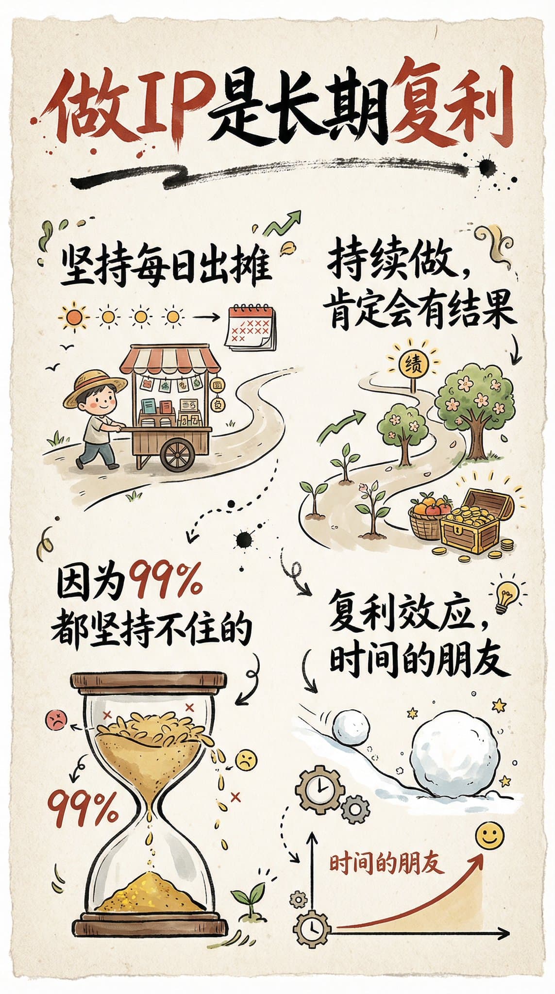
Create a hand-drawn style infographic card with a 9:16 vertical aspect ratio. The card has a clear theme, with a beige or off-white background featuring a paper texture, and the overall design embodies a simple, friendly hand-drawn aesthetic. The card's title is prominently displayed at the top in large, contrasting red and black calligraphic brush script, drawing visual focus. All text content uses Chinese cursive script, and the overall layout is divided into 2 to 4 clear sections, each expressing key points with short, concise Chinese phrases. The font maintains the smooth rhythm of cursive script, being both clear and readable while possessing artistic flair. The card is embellished with simple, interesting hand-drawn illustrations or icons, such as figures or symbols, to enhance visual appeal and evoke thought and resonance from the reader. The overall layout pays attention to visual balance, reserving sufficient white space to ensure the image is concise, clear, easy to read, and understand. The theme is: "Building an IP is a long-term compounding return. Persist in daily work, continue doing it, and there will definitely be results, because 99% won't persevere."
Create Your Own GTA Character
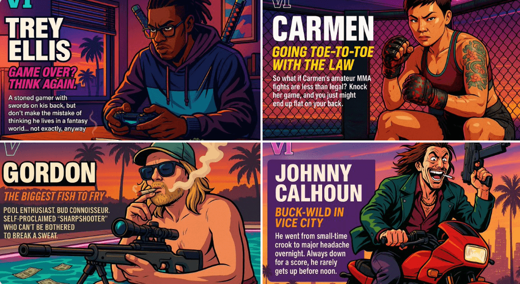
Act as a creative director at Rockstar Games. Create a fictional GTA VI character sheet in the exact same style as the official GTA VI promotional images. The layout must be: A horizontal character sheet, with the character on the right, in a dynamic pose that reflects their personality. On the left, include the following structured text: A small "VI" logo at the top left (mention it visually). The character’s name in big bold text. A catchy slogan or tagline right below in a different bright color. A short backstory (3–5 lines) written in an ironic, street-smart, or playful tone — just like Rockstar’s tone of voice. Use the vibrant Vice City aesthetic with sunset lighting, neon accents, and cel-shaded comic style. The character’s clothing, action, and environment must reflect their archetype and background. Let me customize the following variables: Archetype: {your choice} Gender: {your choice} Skin tone: {your choice} Hairstyle: {your choice} Emotion : {your choice} Outfit: {your choice} Weapon or action: {your choice} Background details: {your choice} Generate a fictive name in tittle and a description in english Format the final result like a finished in-game asset reveal. The vibe should be over-the-top, stylish, and full of personality — as if part of the real GTA VI world. (if the "Your choice" sections are not filled with personalized information, it's up to you to generate it randomly by yourself) generate the visual directly from now on