
Aerial View of Old Beijing
Aspect ratio 16:9. A masterpiece of subtle nuance and visual intelligence. An aerial drone view of the old Beijing urban fabric. The core concept is the Chinese character "衚" **perfectly and seamlessl
Aspect ratio 16:9. A masterpiece of subtle nuance and visual intelligence. An aerial drone view of the old Beijing urban fabric. The core concept is the Chinese character "衚" **perfectly and seamlessly integrated** into the entire city landscape. **Fusion of Typography and Architecture (The Ultimate Subtlety):** - **No Physical Elevation Difference:** The character "衚" is not a separate, towering, or massive structure. The walls forming its strokes are **completely identical in height, material, and style** to all surrounding hutong and siheyuan walls. It resides within the urban fabric, not above it. - **"Sculpted by Light":** The form of the Chinese character is not highlighted by structure, but revealed by **masterful, atmospheric lighting**. A low-angle afternoon sun (Raking Light) sweeps across the entire scene. The light precisely catches the edges of the walls that form the character "衚", subtly brightening them, while casting deep and sharply defined shadows within its "strokes" (i.e., the hutongs). The character is revealed by light, not built by concrete. - **"Atmospheric Perspective":** A thin, ground-hugging layer of morning mist or haze permeates the surrounding courtyards and alleyways, slightly softening the details at the edges. However, the paths and courtyards that form the character "衚" are **subtly clearer and have higher contrast**, thus creating a natural visual focus that allows the hidden shape to emerge in the observer's gaze. **Elegant Typography Layout:** Retain a refined and artistic font design. - **Main Title:** The title "字里京城" (City in Characters/Characters within the City) is laid out in a powerful single vertical column, positioned on the right side. The background area is subtly treated with a semi-transparent, delicate fade effect to ensure readability without being obtrusive. The font is an elegant "Songti" (serif) style, reminiscent of "Xin Songti". A very thin vertical line runs parallel to the text. - **Information Labels:** Label text ("Grey Tiles", "Pagoda Tree") uses small, delicate handwriting. They are connected to objects by a pencil-drawn, pinpoint-thin, hand-drawn curve, as if sketched on paper. **No boxes, no glowing effects.** **Aesthetics:** The overall tone is serene, thought-provoking, and deeply evocative. The color palette is a sophisticated "designer gray," dominated by low-saturation colors, with the only color accents coming from the warm caress of sunlight. The image possesses an aura of a "secret in plain sight," rewarding the viewer's patience and insight. It is a hyperrealistic rendering with a profound painterly feel and philosophical atmosphere. **Negative Prompts:** Towering walls, sculptural Chinese characters, massive structures, overly obvious character shapes, average lighting, flat light, glowing boxes, futuristic UI, sans-serif font, abstract, 2D, vibrant colors, cartoon, bad calligraphy, watermark.
More from Typography
View all →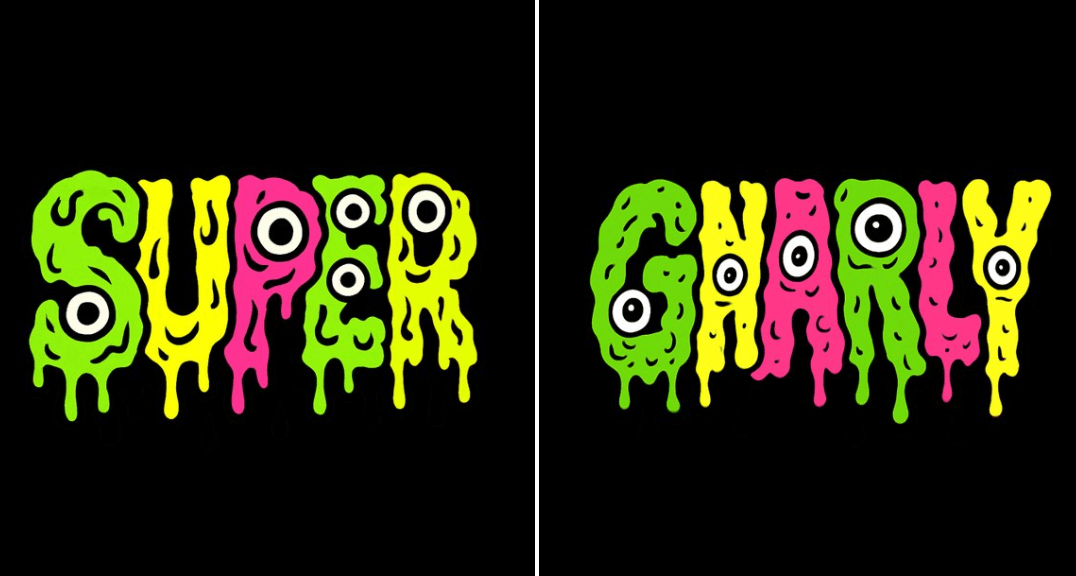
Melting Mutation Text
Create a psychedelic, grotesque cartoon-style text design that says “GNARLY”. Arrange the letters in a straight horizontal line. Each letter should be lumpy, melting, and oozing with bright, clashing flat colors like slime green, neon yellow, and hot pink. Each letter must be filled with only one solid flat color, with no gradients or transitions. All drips, melts, and oozes must be solid black with no shading or gradient. Make the design vector-friendly with clean, solid fills and bold black outlines. Add extra black and white eyeballs to make each letter feel like a weird mutated creature. Keep the composition chaotic but readable, like a mutant version of a Saturday morning cartoon. Black background. Square aspect ratio.
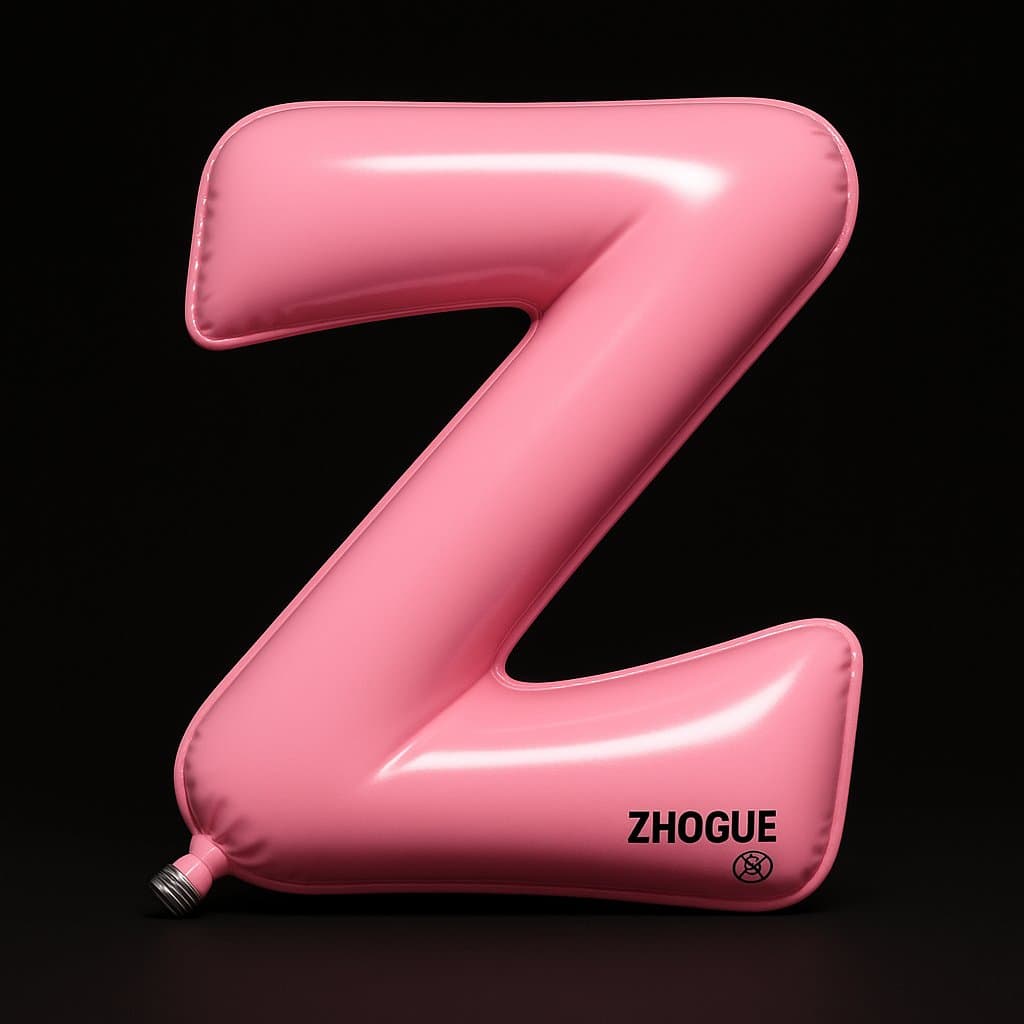
Custom Balloons
A highly realistic 3D installation art: The letter Z is designed as an inflatable balloon shape, with its overall form resembling a smoothly curved "Z" path, composed of two diagonal lines and one sharp fold. Its edges are slightly curled, imbued with a soft pneumatic feel. The viewpoint is a front, slightly upward (approx. 10°) orthogonal projection. The subject is placed perfectly central, occupying almost the entire frame, against a pure black background, creating a focused stage effect reminiscent of a theater spotlight. The material is high-elastic glossy PVC, coated with a high-gloss clear varnish. The main color is a soft bright pink (#FF96AC), with shadows gradually shifting to a pale violet-pink. The surface simultaneously exhibits specular highlights and soft diffuse reflection, presenting a silky, full, and tensioned visual texture. In the bottom left corner, a small but highly realistic silver-grey metal screw valve is visible, hinting at its inflatable nature. The end of the bottom right stroke features a string of black warning text and safety icons, typeset in a "ZHOGUE" style, echoing the visual language of inflatable toys. The main light source comes from the top-left at approximately 35°, producing a clear, hard-edged spotlight effect: an elliptical white highlight forms at the top fold and central diagonal area, while inner-fold shadow areas exhibit soft pink-purple internal reflections. A fill light from the rear-right gently outlines the top and turning edges, separating the form from the black background. The overall light ratio is approximately 1:2, maintaining color transparency and three-dimensionality. The highlight areas have a cooler color temperature, creating a warm-cool contrast to further emphasize the texture. The bladder surface appears slightly bulging, with sharp creases at the folds and turning areas, creating a visual tension between softness and geometry. The deepest turn casts a slender shadow, as if on the verge of bursting; the lower end exhibits a slight stretched sensation, like the tail of a balloon about to be pulled. The overall concept merges the structure of a letter with the material language of an inflatable toy, constructing a "letters can breathe" visual impact through exaggerated volume, realistic lighting, and a minimalist stage feel, presenting a collision of rational geometry and emotional tactile sensation.
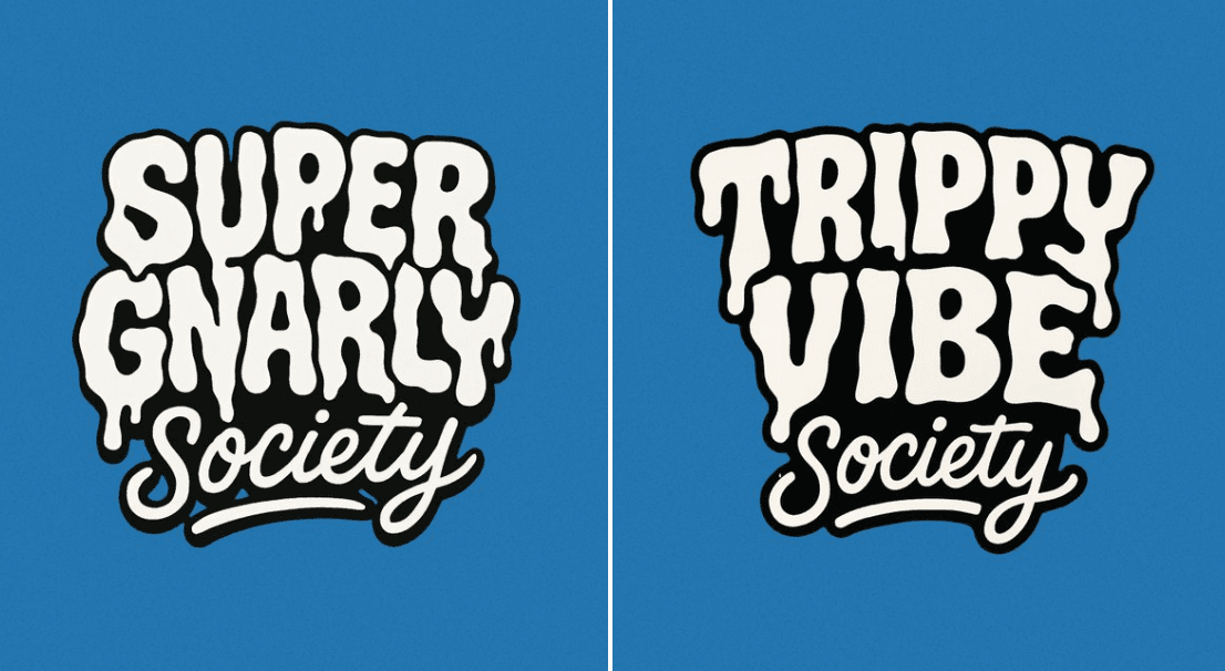
Cartoon Style Text Logo
Create a bold, warped cartoon-style text design with two distinct layers. The top layer should say “SUPER GNARLY” in warped bubble letters with a melty, drippy texture, like ghost slime or goo. The letters should feel heavy and organic, with a slightly psychedelic or paranormal vibe. The bottom layer should say “SOCIETY” in much smaller, script-like or handwritten-style letters that tuck underneath or nestle between the larger title letters. Both layers should be solid white with thick black outlines. No gradients, shading, or texture. Layout should be playful and a little chaotic, but still readable. Vector friendly. Blue background. Square aspect ratio.
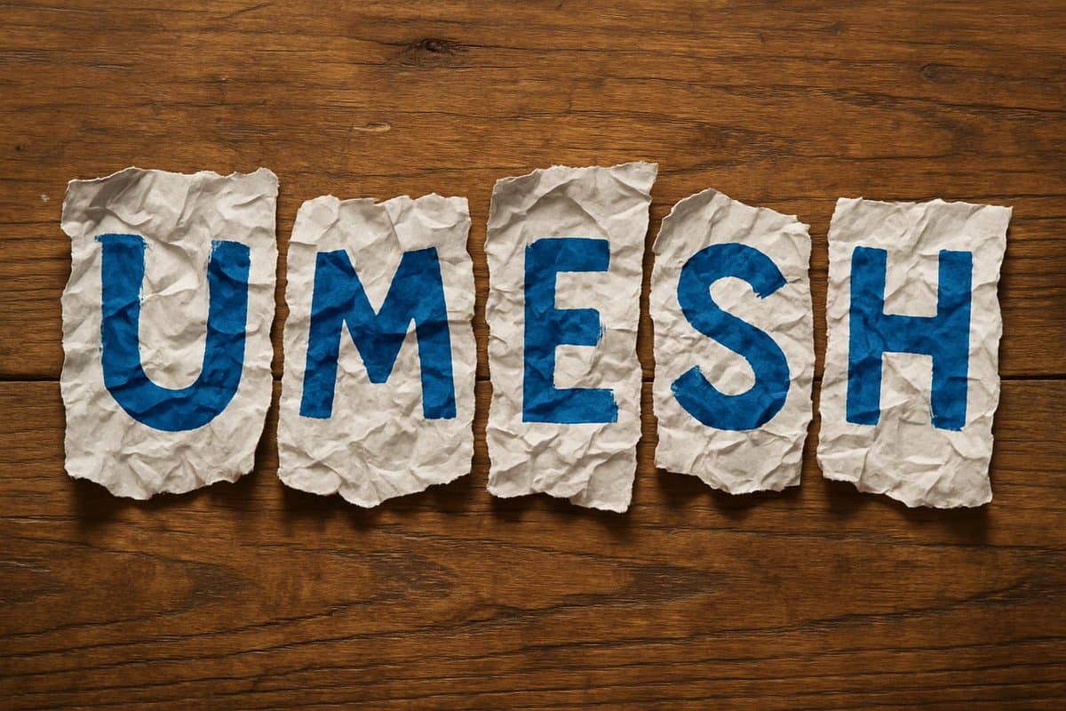
Crumpled Paper
A photorealistic image of the word '[NAME]' spelled out using torn, highly crumpled pieces of white paper. Each letter is painted in bold [COLOR] on individual scraps, arranged loosely and unevenly, as if placed casually by hand, on a wooden table. The composition should convey a natural, handmade aesthetic with visible creases, shadows, and wood grain detail
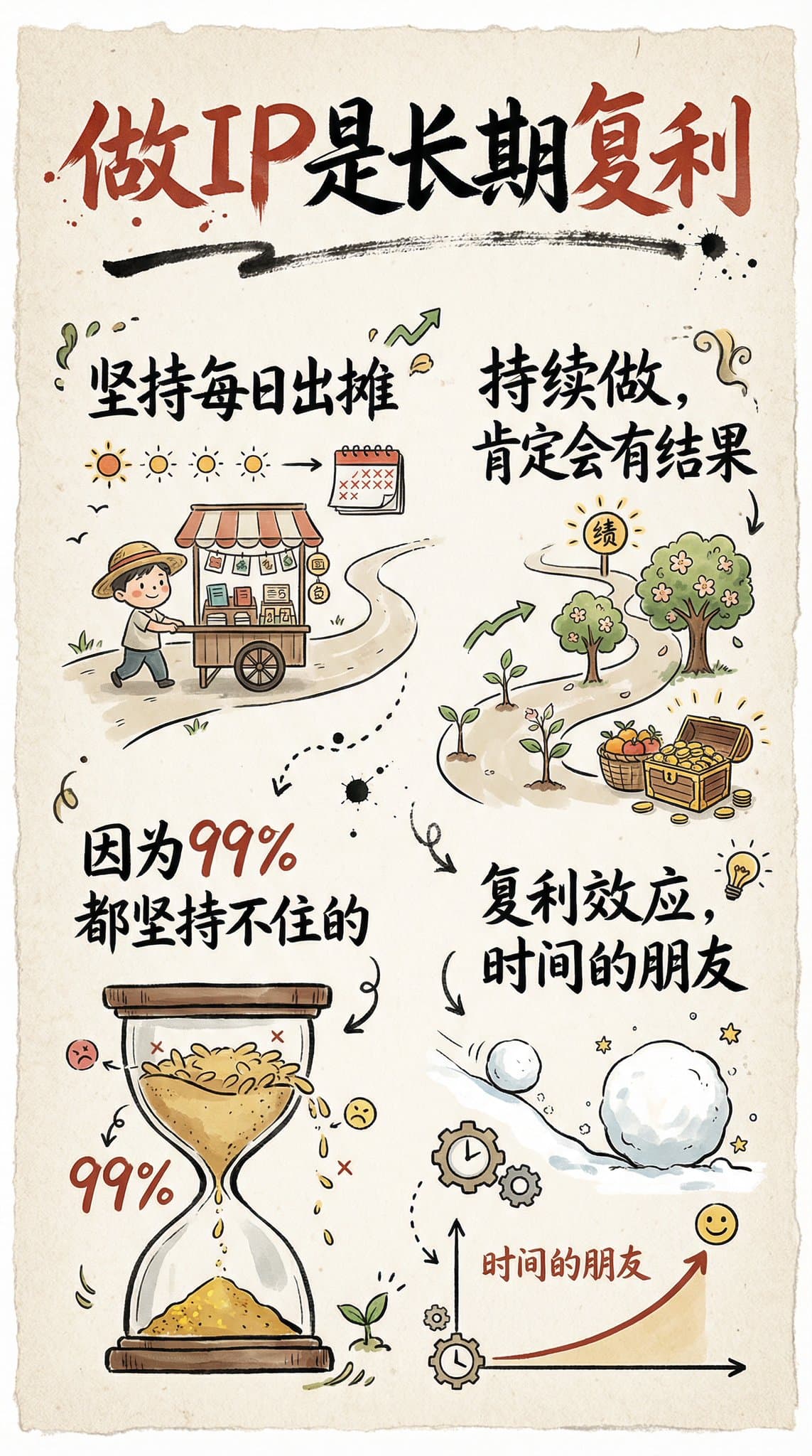
Hand-Drawn Infographic Card
Create a hand-drawn style infographic card with a 9:16 vertical aspect ratio. The card has a clear theme, with a beige or off-white background featuring a paper texture, and the overall design embodies a simple, friendly hand-drawn aesthetic. The card's title is prominently displayed at the top in large, contrasting red and black calligraphic brush script, drawing visual focus. All text content uses Chinese cursive script, and the overall layout is divided into 2 to 4 clear sections, each expressing key points with short, concise Chinese phrases. The font maintains the smooth rhythm of cursive script, being both clear and readable while possessing artistic flair. The card is embellished with simple, interesting hand-drawn illustrations or icons, such as figures or symbols, to enhance visual appeal and evoke thought and resonance from the reader. The overall layout pays attention to visual balance, reserving sufficient white space to ensure the image is concise, clear, easy to read, and understand. The theme is: "Building an IP is a long-term compounding return. Persist in daily work, continue doing it, and there will definitely be results, because 99% won't persevere."
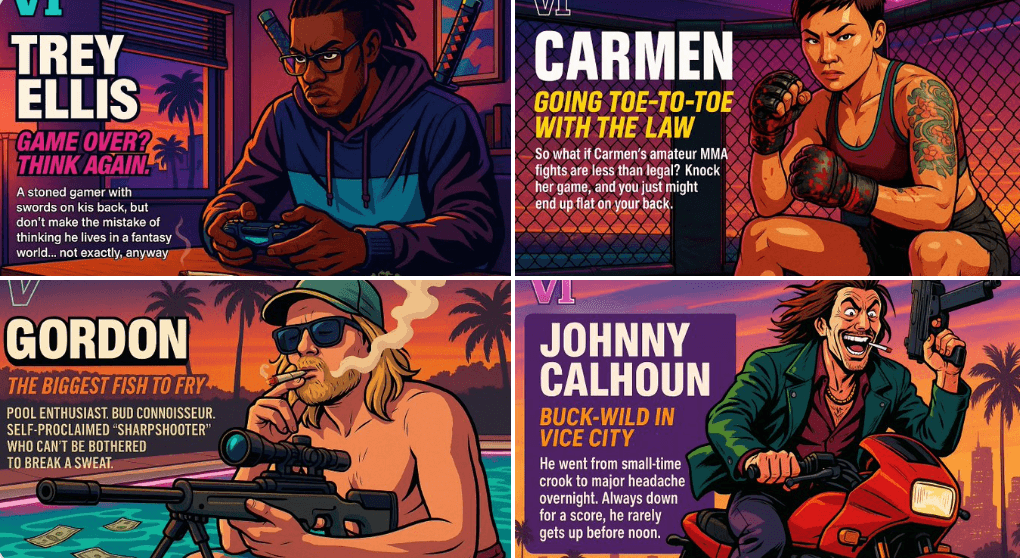
Create Your Own GTA Character
Act as a creative director at Rockstar Games. Create a fictional GTA VI character sheet in the exact same style as the official GTA VI promotional images. The layout must be: A horizontal character sheet, with the character on the right, in a dynamic pose that reflects their personality. On the left, include the following structured text: A small "VI" logo at the top left (mention it visually). The character’s name in big bold text. A catchy slogan or tagline right below in a different bright color. A short backstory (3–5 lines) written in an ironic, street-smart, or playful tone — just like Rockstar’s tone of voice. Use the vibrant Vice City aesthetic with sunset lighting, neon accents, and cel-shaded comic style. The character’s clothing, action, and environment must reflect their archetype and background. Let me customize the following variables: Archetype: {your choice} Gender: {your choice} Skin tone: {your choice} Hairstyle: {your choice} Emotion : {your choice} Outfit: {your choice} Weapon or action: {your choice} Background details: {your choice} Generate a fictive name in tittle and a description in english Format the final result like a finished in-game asset reveal. The vibe should be over-the-top, stylish, and full of personality — as if part of the real GTA VI world. (if the "Your choice" sections are not filled with personalized information, it's up to you to generate it randomly by yourself) generate the visual directly from now on